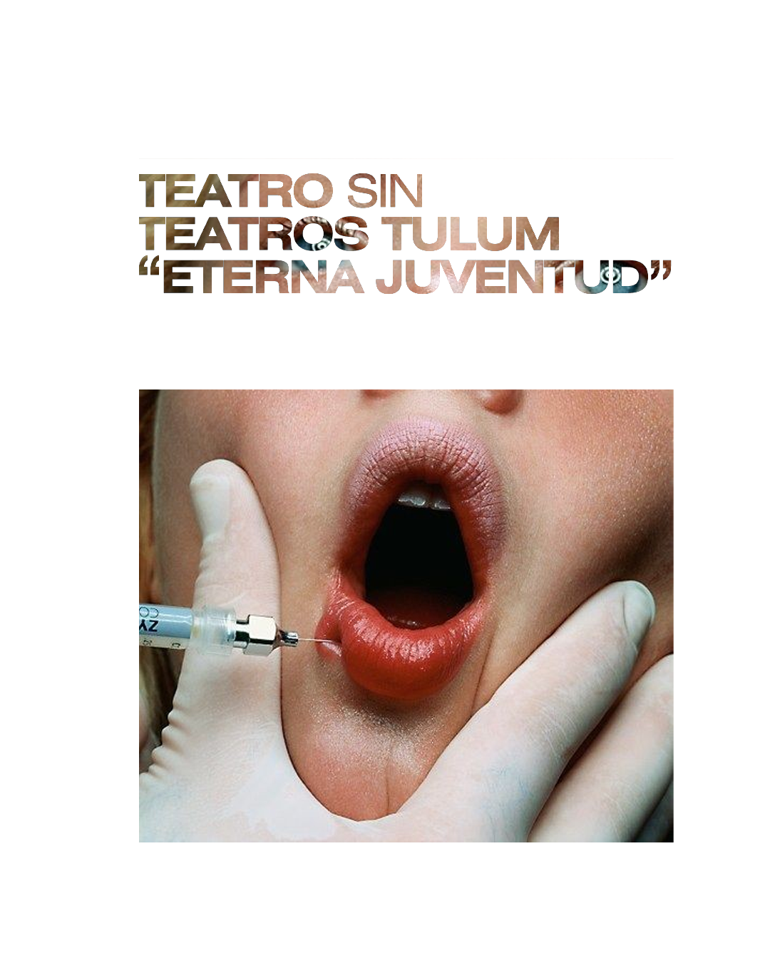
For this project, we explored the concept of pills and pharmaceutical aesthetics as a symbol of the journey—both physical and introspective. The idea was to represent experiences, transformations, and altered states of perception through the visual language of medicine.
We drew inspiration from the clean, clinical design of pharmaceutical packaging, using structured layouts, precise typography, and a controlled color palette. The repetition of pill-like shapes, dosage instructions, and scientific labeling elements created a sense of ritual and intentionality, mirroring the way journeys—whether through space, time, or the mind—require preparation and commitment.
This aesthetic not only evokes the idea of transformation but also plays with the contrast between control and surrender, order and chaos, making the experience feel both methodical and experimental. The result is a visual identity that challenges perceptions, inviting audiences to view travel as a form of prescribed evolution.